Tuesday, 16 October 2012

What were Kellogg's thinking?


Kellogg's will be launching an All Bran breakfast biscuit early next year with the packaging designed fully in-house. Despite Kellogg's commenting that by launching the new product under the All Bran name it sets it apart from similar products already out there I just think they could have at least come up with a unique product. The purpose of the product is identical to that of Belvita's breakfast biscuits and the design is extremely similar. If they are going to release a product identical to one already out there they could have marketed or packaged it differently to set it apart. It's just hard to believe why Kellogg's would use yellow as the main colour and green for the typeface, the same colours on the packaging of Belvita.
Although I don't agree with how they have designed it I think there could be a chance it could cleverly work out for Kellogg's because people are familiar with the Belvita packaging so once Kellogg's breakfast biscuits arrive on the shelf consumers could aim straight for that packaging without realising. It's also a subtle persuasion technique to get people to convert from the Belvita brand to Kellogg's because not many people will go for a product they are unfamiliar with. So if they feel a connection to the same colours and there's little difference in the packaging people will be more persuaded to try the Kellogg's biscuits because they feel reassured they are not much different from the Belvita brand which they might be used to.

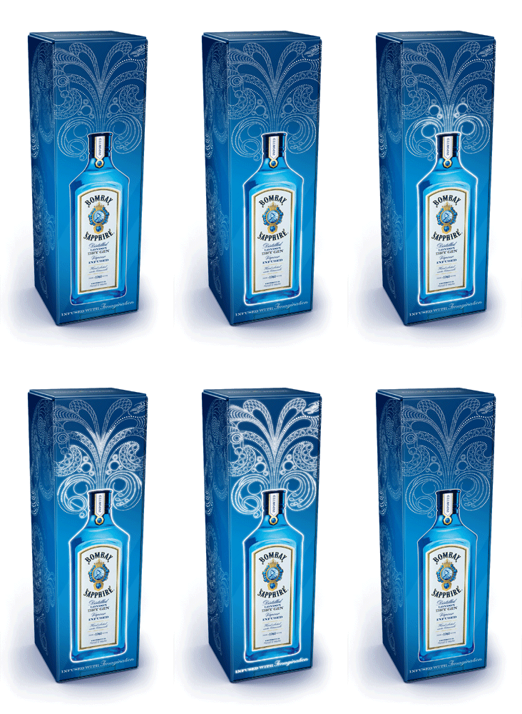
Bombay Sapphire gin - Webb deVlam

Webb deVlam, a branding agency based in both London and Chicago, have designed an innovative packaging design for Bombay Sapphire gin. The illustration actually illuminates when picked up off a shelf due a mechanism that takes place inside the box that then causes the lights to gradually light up in stages. The illustration itself was produced by Yehrin Tong. This particular packaging design is aimed at the travel and duty free customer which I think is appropriate because the illuminations suggest a celebration and an uplifting mood which usually covers many people going on holiday. I think it's a unique way to package something and will definitely make the box stand out on the shelf alongside other popular brands.

Sunday, 14 October 2012

Greenpeace spoof ads

I came across this ad on 'it's nice that' and the fact it made me laugh meant I had to put it on my blog. The ad is a spoof ad from Greenpeace aimed at the Arctic drilling from oil companies such as Shell as referenced in this particular picture. The message behind the ad reflects the corporate nature of oil companies who are primarily a business and often aren't environmentally sustainable when drilling for oil causing polar bears' habitats to be destroyed. Looking at the design of this ad it seems ordinary because we might expect some nice photography in there, a bit of text and a logo but it's once we read the copy that we are captured because it's humourous and memorable. It cleverly acts as reverse psychology as well for the consumer because in a direct mode of address we're being told what to do and so in fact we want to do the opposite which is exactly what organisations such as Greenpeace want. Obviously the ad is just a spoof and Shell deny anything they're being accused which is a shame I think because these ads would probably be quite effective.

The Red Bull Stratos

The Red Bull Stratos. Red Bull sponsored Felix Baumgartner who today broke the record for the highest ever sky dive out of a balloon. He is currently waiting to find out if he achieved his intended record which was to break the sound barrier during his descent. Watching the video it was a long 2 hour wait and pretty boring up until he reached 128,000 ft when he finally took the jump and for the next 4 minutes during his fall I think I might have stopped breathing for a second.
However it's not just for the amazing jump that I chose to blog about this the reason is I think Red Bull have done themselves a favour in choosing to sponsor Felix. His jump lives up to the brand's slogan of 'Red Bull gives you wings' which I think is a clever move for them because this could easily lead on to future ads. Red Bull also made sure they were noticed by strategically placing their logo on Felix's helmet and suit directly in view of each camera. Obviously Red Bull are already a brand linked to sport but I think the Stratos space jump will raise even more attention to the brand.
 

Tuesday, 9 October 2012

Hans Brinker hotel campaign - KesselsKramer

These are 2 print advertisements for the Hans Brinker hotel which is a budget hotel in Amsterdam produced by KesselsKramer advertising agency. Usually with budget hotels people already have low expectations before finding out more information or before they've stayed there so it's ironic how these ads play up to that fact. As always in advertising there has to be a truth within the advert so it's funny that KesselsKramer have taken the negative truths of budget hotels and managed to turn them into a set of humourous posters. I feel in being unconventional with the way Hans Brinker are portraying themselves it has a positive effect because they're actually being honest and not trying to pretend they're a 5 star hotel.
 

Sunday, 7 October 2012

Twitter logo

 
I didn't even notice the Twitter logo had changed! However a lot of people have and don't seem like to like it. Personally I feel as a brand Twitter were right to update their logo as the new bird appears older having lost its tuft of hair (such as a baby might have) and so represents how much the website has grown over the past few years. Analysing the imagery further the bird's beak points upwards in the new logo which could suggest Twitter see themselves constantly improving and aiming for more as a business and a brand.
Twitter have also decided to drop their bubbled righting and the familiar 't' and are now using the new logo across everything to represent themselves. In doing this it just proves how popular they are as a brand and places them amongst big names such as Apple who have the status to just use an image in their logo.
I prefer the older logo in the sense it just looks 'cuter' compared to the new one which is more corporate. However it was probably for the best Twitter revisited their branding with tough competition from Facebook.

Friday, 5 October 2012

Sky 007 channel

http://www.youtube.com/watch

 
Sky have launched their new 007 channel dedicated to all the James Bond movies and with that a pretty good trailer too! I think the ad works well in resembling a chase scene that could quite easily fit in a Bond film. It's clever how they've managed to fit 6 Bonds into the trailer yet the ad still looks smooth with a high level of continuity throughout which must have been quite hard to achieve considering the change in colour and tv over the years. Although the ad has been cut down slightly for the tv edit, the full 1.30 seconds can be viewed with the link to youtube.