Tuesday, 30 October 2012

Bodyform for youuuuu


This is the new hilarious ad for Bodyform which responds to a comment posted by a male on their Facebook page. Richard Neill posted this comment: 

Hi , as a man I must ask why you have lied to us for all these years . As a child I watched your advertisements with interest as to how at this wonderful time of the month that the female gets to enjoy so many things ,I felt a little jealous. I mean bike riding , rollercoasters, dancing, parachuting, why couldn't I get to enjoy this time of joy and 'blue water' and wings !! Dam my penis!! Then I
 got a girlfriend, was so happy and couldn't wait for this joyous adventurous time of the month to happen .....you lied !! There was no joy , no extreme sports , no blue water spilling over wings and no rocking soundtrack oh no no no. Instead I had to fight against every male urge I had to resist screaming wooaaahhhhh bodddyyyyyyfooorrrmmm bodyformed for youuuuuuu as my lady changed from the loving , gentle, normal skin coloured lady to the little girl from the exorcist with added venom and extra 360 degree head spin. Thanks for setting me up for a fall bodyform , you crafty bugger


In response to this Bodyform have created a spoof ad directed at Richard by a woman supposedly being the CEO of Bodyform. The ad is apologising to Richard for misleading him into thinking his girlfriend will have a 'happy period' with images of horse riding and roller skating. I love the attention to detail throughout the ad including drinking the blue water that's so familiar with sanitary towel adverts. It's a clever approach for the brand to respond to this comment rather than just ignore it as I can see this ad becoming very popular!

Sunday, 28 October 2012

Krave sign a deal with C4

Kellogg's have now signed a deal with C4 to promote their Krave cereal aimed at young adults. It's a clever strategic move by the brand because the ads will be aired around the 5th-11th of November during Made in Chelsea and Misfits which are primarily viewed by 16-25 year olds, the exact audience Kellogg's are aiming for. The actual ads for E4 have been created by The Outfit UK. This follows on from the £4 million integrated advertising campaign they have carried out recently with many university students receiving free sample boxes of the cereal (staffs being one of them!). Kellogg's are obviously very aware of their target audience and have clearly chosen the right platforms to promote their product to gain the highest possible attention.

Thursday, 25 October 2012

Picking the right typeface for an ad


These two pages are out of a book from the studio named Handwritten: expressive lettering in the digital age. I've blogged in particular about these ads for Giro helmets made by Tony Calcao who was the art director and letterer for this project because it highlights how important it is having the right typeface on your ad. The three ads feature clever images of common objects made from the helmets with the accompanying words beauty, passion and breathe.
 
Using a handwritten scrawl as the typeface has a much better effect of reinforcing the words being written such as beauty because scrawls are often more personal. The overall feel of the ad could have been more corporate if they had used a formal font such as helvetica so I think in this instance the handwritten typeface works well. 

Gokhun Guneyhan

These two images are by Gokhun Guneyhan who works mainly within the areas of photography and web design. I like his Cities & Typography project (where these two images are taken from) because it shows how typography combined with images can create a certain message.
 For example the top image of Paris portrays the city as being elegant through the use of a serif typeface and a soft filter on the photograph. In contrast the bottom image of Poland suggests that the country is strong and modern because of the sans serif font which is bold and more modern than a serif typeface. More of his work can be viewed on Behance.


Monday, 22 October 2012

The new Nando's campaign

 
Nando's are soon to be launching a humourous campaign made by Wieden & Kennedy that attempts to match people's personalities with one of their sauces. The campaign will be social media based where people are encouraged to use the hashtag #findyourself on Twitter. If consumers then use this hashtag they will receive a prediction from @nandos_official who will analyse their timeline, predict their personality and match them to the most appropriate sauce from mild to extra hot depending on how mad they seem. Users can also go onto Facebook to find the 'peri-predictor' app which presents them with a series of questions and a result of which sauce they are at the end. I actually ended up with the Hot sauce as my answer.
I think this is a fun approach for Nando's and reflects the laid back feel of the restaurant and brand. It's interesting too how they are primarily using social media websites to run the campaign as it's most appropriate for their 18-25 target market so it seems in having this campaign they are wanting to just expand their current market rather than appeal to a new category.

Tuesday, 16 October 2012

What were Kellogg's thinking?


Kellogg's will be launching an All Bran breakfast biscuit early next year with the packaging designed fully in-house. Despite Kellogg's commenting that by launching the new product under the All Bran name it sets it apart from similar products already out there I just think they could have at least come up with a unique product. The purpose of the product is identical to that of Belvita's breakfast biscuits and the design is extremely similar. If they are going to release a product identical to one already out there they could have marketed or packaged it differently to set it apart. It's just hard to believe why Kellogg's would use yellow as the main colour and green for the typeface, the same colours on the packaging of Belvita.
Although I don't agree with how they have designed it I think there could be a chance it could cleverly work out for Kellogg's because people are familiar with the Belvita packaging so once Kellogg's breakfast biscuits arrive on the shelf consumers could aim straight for that packaging without realising. It's also a subtle persuasion technique to get people to convert from the Belvita brand to Kellogg's because not many people will go for a product they are unfamiliar with. So if they feel a connection to the same colours and there's little difference in the packaging people will be more persuaded to try the Kellogg's biscuits because they feel reassured they are not much different from the Belvita brand which they might be used to.

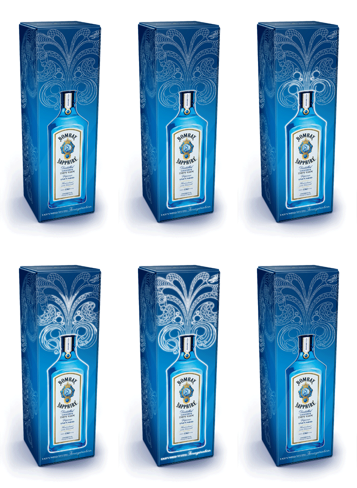
Bombay Sapphire gin - Webb deVlam

Webb deVlam, a branding agency based in both London and Chicago, have designed an innovative packaging design for Bombay Sapphire gin. The illustration actually illuminates when picked up off a shelf due a mechanism that takes place inside the box that then causes the lights to gradually light up in stages. The illustration itself was produced by Yehrin Tong. This particular packaging design is aimed at the travel and duty free customer which I think is appropriate because the illuminations suggest a celebration and an uplifting mood which usually covers many people going on holiday. I think it's a unique way to package something and will definitely make the box stand out on the shelf alongside other popular brands.