Sunday 18 November 2012

Telegraph thermal wrap for Age UK

 
The Telegraph newspaper yesterday (17th November) featured a thermal cover wrap around the paper to remind people how donations to the Age UK charity can help keep old people warmer this winter. The dull and grey image with Lynda Bellingham was printed in thermal ink so that when the reader touched the image the colour would change to orange. The wrap was designed by the Telegraph's in-house creative team in conjunction with Age UKs own ad agency Karmarama.
I think this is a clever way to get their point across and as a charity their aim is to raise awareness and reach out to as many people. Often an ordinary ad just placed in between articles can be ignored so by engaging the reader and creating an 'experience' for them they are likely to remember what the ad is for and take notice. This clever strategy is unique in reinforcing what the charity wants from the reader and by encouraging the reader to touch the whole image to change the colour it shows how that individual can change things on a larger scale too. Furthermore for Age UK to choose to place this ad in The Telegraph and not a newspaper such as The Sun suggests they are hoping to gain donations from people who have more disposable income and who may be more willing to part with their money especially around Christmas time.
The article for this can be found here http://www.campaignlive.co.uk/news/

Sunday 11 November 2012

Twining's re-branding

BrandOpus have redesigned Twinings herbal teas making them more bold and illustrative than the previous packaging. The new modern look could attract a younger market who might be attracted to the contemporary feel of the boxes because they could relate more to the packaging. BrandOpus have explained how the swirling patterns and illustrative designs reflect the infusion process involved when making a cup of Twinings herbal tea.
 
However I personally don't like this new design. I think it lacks continuity across all of the flavours and that's an important part of branding. Considering it's only these new flavours of herbal teas which have had their packaging redesigned I think that further isolates them from the rest of the Twinings products. They could have at least redesigned more of their products to improve the continuity.
 
This is just an example of the older packaging of their herbal tea which I think is more visually appealing because it's simple and there is less going on than in the new designs. This design is more recognisable and appropriate to the Twinings brand because if the newer packaging didn't have the Twinings logo I would think it was a completely different brand. Twinings could possibly be aiming for a more modern brand identity but I think their heritage and history is a quality they should stick with.


When product placement goes bad

 
Budweiser are currently not too happy with Paramount Pictures for negatively portraying the beer in one of their films due to be released later this year. The film named Flight features Denzel Washington as a pilot who opens a can of Budweiser whilst trying to fly his plane, luckily avoiding any crash but is then subjected to an investigation as to why he flew the plane drunk. Following on from this Budweiser have complained Paramount didn't ask for permission and have asked them to either obscure or remove the Budweiser logo from the film.
 
This is just an example of product placement which rather than promoting a product can have the opposite effect. Although Budweiser might not have much control over this the way the beer is portrayed will have a negative effect on the brand because it's being associated with alcoholism and in turn could put people off. It just shows how important brand association is for consumers because without realising it certain things can persuade us to buy or not buy a product. Similarly Heineken have recently become associated with James Bond after he was shown drinking a bottle in Skyfall which will have a positive effect for their brand because if James Bond drinks it then people will assume it's trendy.

Hamley's get rid of pink and blue

 
Old - Left       New - Right
 
The world famous Hamley's toy store in London have changed their signage which sees the pink for girls and blue for boys sign being changed for a more neutral red and white. Toys are now categorised by their type such as 'art's and crafts' or 'dress up' without specifying which gender they belong to. However Hamley's have responded saying their change has nothing to do with campaigns but more to improve customer flow within the store.
 
Despite this I think Hamley's were right to change the colour of their signs because within society today it's probably old fashioned to say pink is for girls/blue for boys. As a brand it keeps them more current and avoids any sexist or gender campaigns towards them but I just don't think any of the children shopping there are going to care much. The new signs might improve sales for Hamley's because previously parents/children might have avoided a large section of the store and headed to where they felt most appropriate, probably missing toys that they potentially would have bought i.e. parents of a boy might have missed out all of the floors beneath just to get to the 'boy' section.


the best Movember can get..

 
We're well into Movember now but I was reading how Gillette have actually launched a 1940s style barber shop in London on Carnaby Street to support the Movember cause. The idea being visitors can be given a luxury experience and styling tips to make the most of Movember all by using the Gillette Fusion ProGlide Styler. I think it's a good idea Gillette have teamed up with Movember because we would expect Movember to have a bad effect on Gillette's razor sales however they have cleverly managed to avoid this.

National Express ad banned


The ASA have banned an ad from the National Express which as you can see featured a can-can dancer with her leg in the air. National Express defended the ad saying it was cultural and linked to the places they were trying to sell however the ad was banned following a number of complaints that it degraded women and displayed them as sex objects. I personally think the ad is slightly degrading although I can understand why National Express chose that image I just think it could have been used in a less obvious way to express their idea better without offense.
 
There is obviously the issue within society of how women are portrayed not just within ads but in films and music videos as they are generally portrayed with the male gaze in mind. I don't think using women as sexual objects will ever be completely stopped as there are always subtle ways around it and sometimes using women in this way is most appropriate for the product, particularly perfume or beauty products.

Beats by Dr Dre


The Beats by Dr Dre brand are looking to up their marketing campaign in the UK within the next few months and aim to make their link with fashion and music much stronger. It's predicted the marketing team will try to find 'localised' ambassadors to endorse the product as Justin Bieber does in the US. Although currently established within the UK the brand has commented they want to be more familiar with sports personalities and be featured within music videos.
 
However my problem with this is I just think the trend of having these headphones has been and gone. There was previously a surge of interest in them when they were first released in the UK and they seemed to be more of a fashion icon for most people so I'm just not sure if people will be interested the second time round now the novelty has worn off? 

Waitrose launch 'unglamourous' Christmas campaign

 
Waitrose have chose to go in the opposite direction to most brands out there and launched an 'unglamourous' Christmas campaign. The ad stands out because it's unconventional of the typical festive ads we see around this time of year, it's not an ad featuring a nice christmas dinner or somebody buying presents it's the simple idea that they are giving more to charity instead. It's obviously going to work wonders for their corporate social responsibility because they are saying that rather than having a fancy christmas ad they are giving an extra £1million to local charities. It actually works well in creating negativity for other brands such as John Lewis who have gone with their traditional festive ads because it makes them seem like they don't care as much for charity as Waitrose do.
Interestingly although Waitrose are priding themselves on spending more money on charity rather than a Christmas campaign they still cleverly managed to get a bit of celebrity endorsement with Delia and Heston. I think without them the ad itself would become forgettable because although there's a good cause behind it, it's actually quite boring and I only remember it because it has the celebrities in. Overall though I think it's a good approach to make Waitrose stand out amongst all the similar and typical Christmas ads that will be flooding our televisions for the next month.

Saturday 10 November 2012

'Don't let winter get you down'

 
This is the new ad by BBH for RAC since they picked up the business in the summer. The RAC have commented that the ad is a 'departure from the campaigns normally employed by the breakdown industry'. The traditional child-like music in the background works well in making the ad appear more fairytale like and is more positive than previous ads which often focus on the fear of breaking down and are often serious. It creates a nice juxtaposition in that it is a friendly, welcoming approach to the serious and dangerous subject of breaking down during winter. Introducing the children playing in the ad suggests that RAC are hoping to aim at the family audience. They have also created a new USP as a brand because the ad is selling a new 'At Home' service for anyone who joins this winter so it makes a change for a breakdown ad to not have the common image of being stuck at the side of a motorway.

#holidaysarecoming


Tonight during the X Factor, Coca Cola will be launching their famous 'Holidays are Coming' ad which is part of their latest 2012 Christmas campaign. The ad itself is just a small part of the integrated marketing campaign which is spread across both Twitter and Facebook. Coca Cola will be introducing the new hashtag #holidaysarecoming to the ad to encourage people to tweet or post about it and ultimately get everyone talking about the famous ad. It's also clever they have decided to launch the ad tonight during X Factor because it's obviously watched by all the family and the Coca Cola campaign and product are very family orientated.
Another part of the campaign will see the iconic Christmas truck delivering 'the ultimate christmas experience' to local heroes appointed by their communities. Although this seems like an honest and good gesture by Coca Cola it is a clever move by the brand to improve their corporate social responsibility because they are showing they care for communities and want to be recognised as doing so.

Big Issue trials their digital version


Big Issue in the North are launching a trial of the world's first digital street magazine. 999 Design have worked with Big Issue to create QR cards which are sold by the vendors and then allow customers to download the digital version of the magazine straight onto their device. Not only are the magazine keeping in line with the way technology is advancing but it's good to see that whilst doing this they are doing it sustainably because the vendors can still keep their jobs. Many printed magazines and newspapers all now have their digital versions so I think Big Issue are right to start trialling theirs because it makes them more current and accessible to the customers. It's currently only being trialled in Manchester for at least 3 months however if it seems successful it could move to London too.

Monday 5 November 2012

Forever Ink tattoo care range


Forever-Ink-packagin_482.jpg 

This is the new Forever Ink skincare range for tattoos. The visual branding has been carried out by Anthem Worldwide. They say the logo for the brand was inspired by David Beckham's tattoo of angel wings with the connotation of protecting something. I find the product interesting as it will attract a niche market of people with tattoos and there aren't very many products that specialise in tattoo protection so I think the product will be successful. There currently seems to be a trend for tattoos, most of my friends have recently had their first tattoo, and following on from a what's new session tattoos seem to be a British thing so it's probably a good job this kind of product has been released. 

Sunday 4 November 2012

Vintage art in advertising

 These ads are an example of vintage art working well within advertising. The vodka ad created by Wieden & Kennedy uses the work of Mort Künstler who is famous for his strong oil paintings of famous scenes in American history. The Stella Cidre ad from 2011, created by Mother agency, uses the same vintage aesthetic to promote their more sophisticated cider. Using vintage art creates a feeling of nostalgia around the products which could attract an older target market who may be able to relate more to the era in which the style comes from. Particularly during tough economic or political times people want to revert back to tradition and what they find as comforting so in these two particular cases the vintage feel could work well in gaining consumers.

Every little helps.

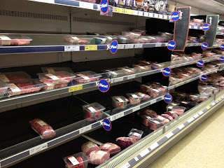
When shopping at Tesco this weekend I noticed they have changed the colour of their shelves from white to black. Now this doesn't seem like a major thing but it works well in making the aisles appear more upmarket and exclusive. Recently supermarkets have become more and more competitive in attracting consumers and so they have to keep changing tactics to gain customers. For Tesco, an average level supermarket, it seems they are now trying to market themselves higher on the scale closer to a supermarket such as Sainsbury's or Waitrose.

It'll be interesting to see if similar supermarkets such as Asda follow suit in changing the interior of the store to catch up to the competition. I don't think changing the colour of the shelves in Tesco will make a huge difference to the number of people that decide to shop there but it could encourage current shoppers to spend a little bit more on their products if they feel they are in a more luxury environment. 

Saturday 3 November 2012

Obama in a different light

 I thought these photographs seemed relevant to blog about considering the presidential debate currently taking place in the lead up to the election. They were taken by Pete Souza who is currently the White House photographer.
I think Barack Obama missed a trick in not using this pictures for his campaign because they show a soft, intimate side to him which makes him relatable. He could have probably won a few more votes with these! It's nice to see images we wouldn't usually expect of someone which I think is why these pictures work so well because they portray his true personality without being overly biased.

EE Ad


The new brand EE (Everything Everywhere) have launched their first TV ad tonight made by Saatchi & Saatchi starring Kevin Bacon. The ad explores how Kevin Bacon knows so many people from Tom Hanks to Ken Barlow thanks to the network EE and lets the audience know they can be like him by signing up. I understand the ad wants to connect with as many people as possible to gain consumers which is why they have probably gone with the humourous tone to allow people to relate but it just didn't amaze me. Considering this new network is a big deal and bigger than other networks out there (since they own Orange and T-Mobile) I just thought they might have created an ad that wows a bit more than this one.


Walking really is greener than driving


This is the impressive work from Jody Xiong of DDB China who cooperated with the China Environmental Protection Foundation to highlight how choosing walking over driving really is greener. Massive drawings of trees were unfolded on pedestrian crossings across 15 cities in China. Either side of the crossings were large green sponges that meant as people walked across the road they would create the leaves on the tree.
There are so many ads already out there trying to make people more aware of global warming and their carbon footprint but this is a different approach and seemed to work because it simply cannot be ignored. I find it more effective too because rather than being hard hitting or using an aggressive approach to try and make people change it's light hearted and makes you smile.